Experts have a few important tips to help you handle the flood of COVID-19 statistics.
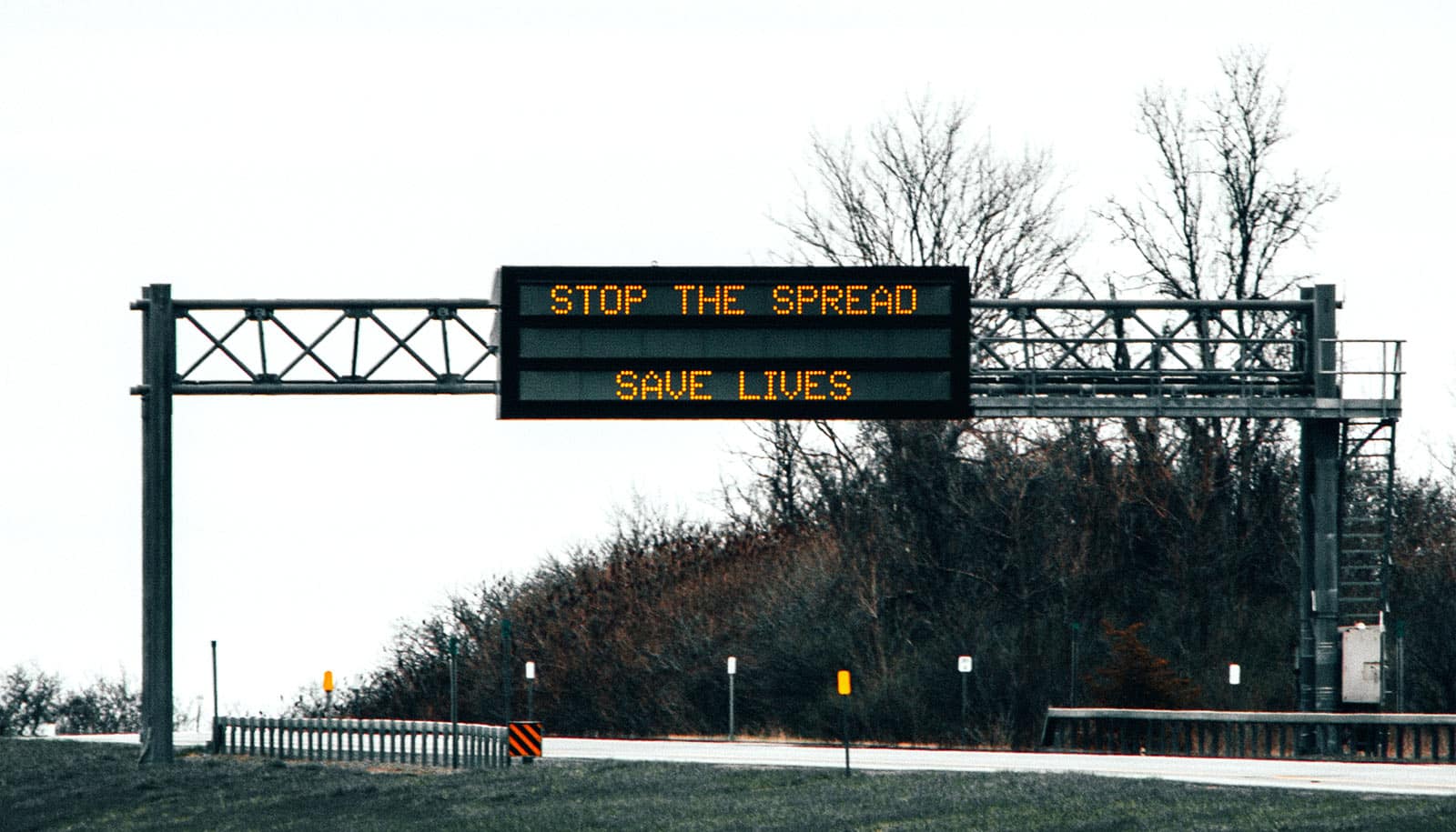
We’re confronted around the clock with troubling data as reporters, public health experts, and elected officials seek to understand and describe the path and impact of COVID-19. Rates of infection, hospital admission, and death are just a few key indicators.
“…we need statistics—good statistics—to talk sensibly about social problems.”
With so many numbers to digest, it can be challenging to separate COVID-19 statistics that may mislead from those that illuminate—something that has complicated the decision-making of government officials, according to recent news accounts.
In addition, while the widespread suspicion that numbers can be manipulated to support almost any conclusion predates the pandemic, partisanship around the response to the virus has further undermined Americans’ trust in COVID-19 data, according to a recent Pew Research Center survey.
But statistics are, of course, vital to understanding the current COVID-19 crisis, as well as other complex problems such as poverty, economic downturns, and climate change, and so researchers stress the importance of learning to distinguish what’s useful from what may be junk.
“We suspect that statistics may be wrong, that people who use statistics may be ‘lying’—trying to manipulate us by using numbers to somehow distort the truth,” writes sociologist Joel Best in his book Damned Lies and Statistics (University of California Press, 2012). But, he explains, “[t]he solution to the problem of bad statistics is not to ignore all statistics, or to assume that every number is false. Some statistics are bad, but others are pretty good, and we need statistics—good statistics—to talk sensibly about social problems.”
To help enhance our own statistical literacy as the pandemic continues, Andrew Gordon Wilson and Jonathan Niles-Weed, assistant professors at New York University’s Center for Data Science and the Courant Institute of Mathematical Sciences, outline some principles to keep in mind when evaluating figures cited in the news.
Wilson’s and Niles-Weed’s tips appear below, but both caution that training in data science alone isn’t enough to equip leaders to make perfect decisions.
“Many people—statisticians included—think that every problem can be solved by getting better data,” says Niles-Weed. “But even with perfect information, beating COVID will require politicians and public health experts to weigh very different considerations and make hard choices despite uncertainty. Data can help, but setting good policy also requires incorporating values and goals.”
1. Be certain about uncertainty in COVID-19 stats
“Many of the facts and figures we see come with big unstated error bars,” warns Wilson. “Suppose the only person in a village tested for coronavirus tests positive. It could be reported that the incidence rate in that region is 100%. You might say, ‘Surely they need to test more people?’ But how many people should we test for an accurate incidence estimate? Ten people, 100 people, 10,000 people? What’s a reasonable sample size? And do we only test symptomatic people? What fraction of the population is asymptomatic? What constitutes ‘accurate’?
“Similarly, models predicting quantities such as incidence rate take many variables as input, such as case fatality rate. These inputs similarly have big uncertainty attached to them. We should be conscious of uncertainty in parsing numbers we see in the media—the point predictions, without reasonable estimates of the error bars, are often meaningless.”
2. Separate trends and random occurrences
“Random variation in data can easily be mistaken for a genuine trend,” says Niles-Weed. “Even if the underlying situation is static, data may change from day to day because of random noise.
“For example, if a state’s newly confirmed cases are particularly high during a given week and lower the next, it’s easy to interpret this as meaningful: perhaps the high caseload in one week made citizens more cautious, leading to a drop in cases the next week after behaviors changed. But it’s just as likely that the first week was just a random outlier, and that nothing at all changed. By contrast, sustained day-over-day increases or decreases can indicate real trends.”
3. Interpret probabilities carefully
“It’s easy to confuse conditional probabilities, which is significant during a pandemic because it can lead to a misreading of testing data,” notes Wilson. “For example, in taking a test for coronavirus, we care about the probability that we have coronavirus given that we test positive—and not the probability that we test positive given that we have coronavirus.
“We have to carefully interpret what a probability is telling us. For example, the sensitivity of a test tells us the probability that we test positive, given that we have the condition. Similarly, another measure—the specificity—is the probability of a negative result if we don’t have the condition,” he says.
“If a test has a high sensitivity, and is thus reported as highly accurate, it does not mean testing positive means we are likely to have coronavirus, especially if the general rate of coronavirus in the population is low. Similarly, if the general rate of coronavirus is high, a negative test result may have high probability of being a false negative, even when the test has high specificity.”
4. Check for sample bias
“While a truly random sample can give precise information about the whole population, bias can arise if some people are more likely to be included than others,” explains Niles-Weed.
“For example, if a research team performs antibody tests on a random set of people walking down a city street, they will invariably miss those too sick to leave their beds. Data collected in this way can fail to be representative when extended to the whole population.”
5. Beware of missing information in COVID-19 statistics
“Many claims are factually correct but misleading due to crucial missing information,” says Wilson. “For example, it may be correct to report that a majority of confirmed cases in a region are Asian, but if only a very small number had tested positive, that may not be a meaningful finding. Similarly, there are many correlations that can easily be explained away by missing causal factors.
“It was reported at one time that health care workers in New York have a slightly lower incidence of coronavirus than the general population. Does that mean social distancing is ineffective, since these workers will be more exposed to infected people? If we condition on the fact that health care workers are trained to be vigilant in mask wearing, hand-washing, distancing, and sanitization, it likely means the exact opposite!”
Source: NYU