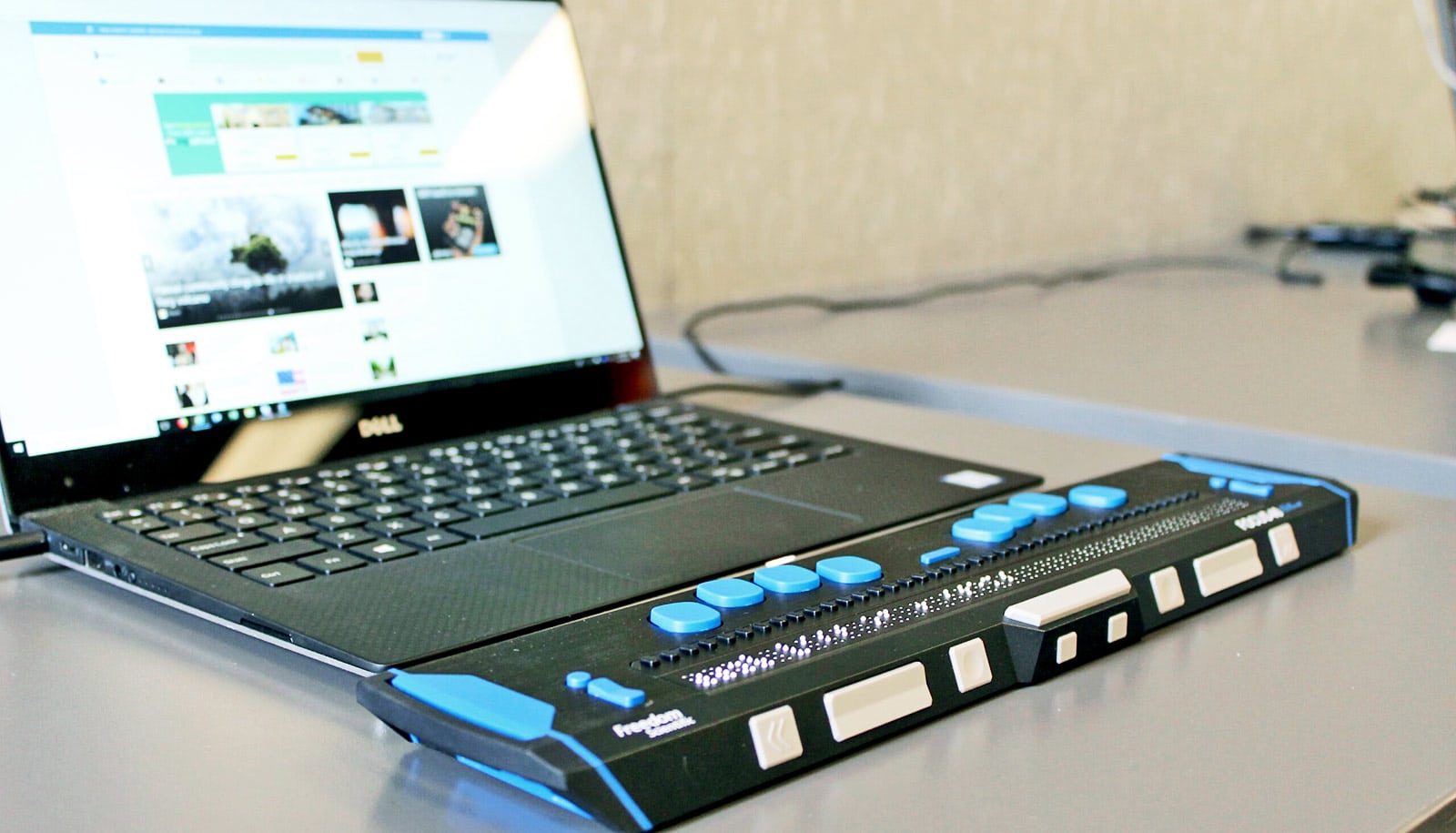
VoxLens is a JavaScript plugin that, with one additional line of code, allows people who use screen readers to interact with visualizations.
Interactive visualizations have changed the way we understand our lives. For example, they can showcase the number of coronavirus infections in each state.
But these graphics often are not accessible to people who use screen readers, software programs that scan the contents of a computer screen and make the contents available via a synthesized voice or Braille.
“This work is part of a much larger agenda for us—removing bias in design.”
Millions of Americans use screen readers for a variety of reasons, including complete or partial blindness, learning disabilities, or motion sensitivity.
VoxLens users can gain a high-level summary of the information described in a graph, listen to a graph translated into sound, or use voice-activated commands to ask specific questions about the data, such as the mean or the minimum value, its creators report.
“If I’m looking at a graph, I can pull out whatever information I am interested in, maybe it’s the overall trend or maybe it’s the maximum,” says lead author Ather Sharif, a doctoral student in the Paul G. Allen School of Computer Science & Engineering at the University of Washington.
“Right now, screen-reader users either get very little or no information about online visualizations, which, in light of the COVID-19 pandemic, can sometimes be a matter of life and death. The goal of our project is to give screen-reader users a platform where they can extract as much or as little information as they want.”
“In the field of accessibility, it’s really important to follow the principle of ‘nothing about us without us.'”
Screen readers can inform users about the text on a screen because it’s what researchers call “one-dimensional information.”
“There is a start and an end of a sentence and everything else comes in between,” says co-senior author Jacob O. Wobbrock, professor in the Information School. “But as soon as you move things into two dimensional spaces, such as visualizations, there’s no clear start and finish. It’s just not structured in the same way, which means there’s no obvious entry point or sequencing for screen readers.”
To begin the project, the team worked with five screen-reader users with partial or complete blindness to figure out how a potential tool could work.
“In the field of accessibility, it’s really important to follow the principle of ‘nothing about us without us,'” Sharif says. “We’re not going to build something and then see how it works. We’re going to build it taking users’ feedback into account. We want to build what they need.”
To implement VoxLens, visualization designers only need to add a single line of code.
“We didn’t want people to jump from one visualization to another and experience inconsistent information,” Sharif says. “We made VoxLens a public library, which means that you’re going to hear the same kind of summary for all visualizations. Designers can just add that one line of code and then we do the rest.”
The researchers evaluated VoxLens by recruiting 22 screen-reader users who were either completely or partially blind. Participants learned how to use VoxLens and then completed nine tasks, each of which involved answering questions about a visualization.
Compared to participants from a previous study who did not have access to this tool, VoxLens users completed the tasks with 122% increased accuracy and 36% decreased interaction time.
“We want people to interact with a graph as much as they want, but we also don’t want them to spend an hour trying to find what the maximum is,” Sharif says. “In our study, interaction time refers to how long it takes to extract information, and that’s why reducing it is a good thing.”
The team also interviewed six participants about their experiences.
“We wanted to make sure that these accuracy and interaction time numbers we saw were reflected in how the participants were feeling about VoxLens,” Sharif says. “We got really positive feedback. Someone told us they’ve been trying to access visualizations for the past 12 years and this was the first time they were able to do so easily.”
Right now, VoxLens only works for visualizations that are created using JavaScript libraries, such as D3, chart.js, or Google Sheets. But the team is working on expanding to other popular visualization platforms. The researchers also acknowledged that the voice-recognition system can be frustrating to use.
“This work is part of a much larger agenda for us—removing bias in design,” says co-senior author Katharina Reinecke, associate professor in the Allen School. “When we build technology, we tend to think of people who are like us and who have the same abilities as we do.
“For example, D3 has really revolutionized access to visualizations online and improved how people can understand information. But there are values ingrained in it and people are left out. It’s really important that we start thinking more about how to make technology useful for everybody.”
The team presented their project at CHI 2022 in New Orleans.
The Mani Charitable Foundation, the University of Washington Center for an Informed Public, and the University of Washington Center for Research and Education on Accessible Technology and Experiences funded the work.
Source: University of Washington