A new study identifies a way for scientists and scientific journals to share new research with even more people on Twitter.
A Twitter-friendly graphic called a visual abstract can nearly triple the number of people who click the link in the tweet to read a full scientific paper, the study shows.
The results appear in the Annals of Surgery, a journal that began creating visual abstracts for selected research papers last July. More than 20 journals across medicine, basic science, and social science have started doing the same in recent months.

Working with colleagues who also serve on the journal’s editorial board, surgery resident Andrew Ibrahim designed a study to measure the effect of the visual abstract in its first months.
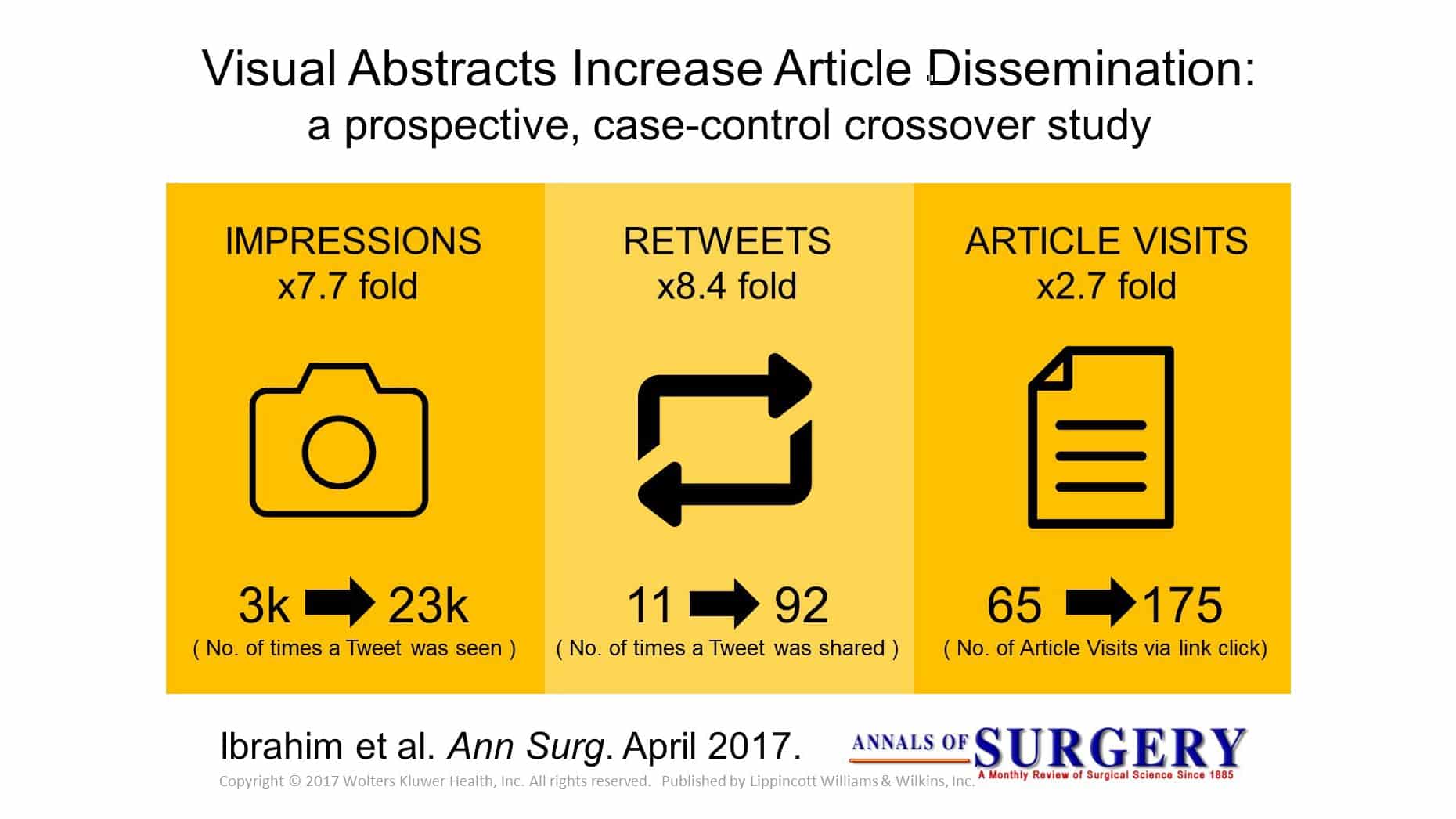
The researchers chose 44 papers for the Annals Twitter account to share, both with and without visual abstracts attached to the tweets. Half of the papers had no-graphic tweets sent out first, then later had a visual abstract shared. The other half went in the opposite order.
In all, the tweets with the visual abstracts were retweeted more than eight times as often and were seen by nearly eight times as many people. And 2.7 times as many people clicked the link in the visual abstract tweets to read the full paper.
Like a movie trailer
Ibrahim, a clinical scholar at the University of Michigan Institute for Healthcare Policy and Innovation, emphasizes that visual abstracts aren’t meant to replace a paper but to act as a “movie trailer” to help busy researchers and clinicians quickly decide if they want to read the full paper.
Ibrahim, who studied architecture and design as well as medicine, began creating visual abstracts as a way to summarize a research study with just a few icons, words, and numbers, aimed at other researchers and people in the medical field.
As the journal’s founding creative director, he launched the Annals program as part of the journal’s effort to increase its social media presence and engagement.
Official accounts can squelch rumors on Twitter
“This was a unique opportunity where my skill sets overlapped,” he says. “The journal had been automatically tweeting the titles and links for each paper it published, and then we began tweeting graphs or charts from the papers. But our first visual abstract had 10 times the retweets as normal.”
More clicks
The study documents the impact of the journal’s first 44 visual abstracts, from July to December 2016. The journal’s editorial board chose the papers for their broad potential interest to surgeons and surgical researchers.
“At first, people were concerned that visual abstracts are a superficial ‘click and share’ thing,” says Ibrahim. “But the fact that it drove up the click-throughs to the full article threefold means more people are engaged in the work. Still, we will need to study this over the longer term to see if has an impact on citations of those papers.”
During a weather disaster, Twitter does what satellites can’t
In January, Annals began inviting all researchers whose work was accepted for publication to use a template to create a draft visual abstract for their work. Ibrahim edits the visual abstracts, and many are chosen for sharing via the Annals Twitter account, which has more than 18,000 followers.
Ibrahim also offers materials on the web for researchers who wish to create their own visual abstracts and has helped other journals understand the key principles of designing them.
Senior author Justin B. Dimick, an associate editor at Annals and director of the Center for Healthcare Outcomes & Policy at the University of Michigan, says, “The uptake from other journals has been rapid. I would not be surprised if every major research publication is using visual abstracts within the year.”
Researchers have also begun repurposing their visual abstracts in presentations, on the web, in outreach to reporters, and on other social media platforms. More journals and institutions now offer help to researchers to marry the scientific expertise needed to make a visual abstract with the design skills to make it readable at a glance.
“We’ve also modified our design in response to feedback; for instance, adding p values so a Twitter user can see the statistical significance of the result,” Ibrahim says. “Sometimes we’re trying to summarize five years’ worth of work in a single graphic, and we never claim it’s a substitute for reading the full article or even the text abstract. But it’s a way to help people decide if this is a paper they’d be interested in reading or not.”
Learn how to make a visual abstract with Ibrahim’s open-source primer for visual abstract development.
Source: University of Michigan


