There are rapidly forming COVID-19 hot spots across the United States, including in southern states such as Arkansas, Tennessee, and Mississippi, according to a group of data scientists.
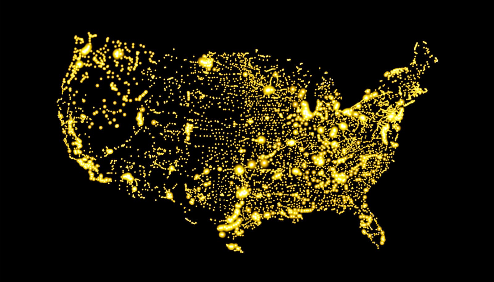
Looking at data at the county level rather than the state level allowed them to find trends “hidden” in the larger view, the researchers say. The results, compiled in an interactive visualization, are a way to more efficiently track coronavirus clusters and direct urgently needed resources.
“County-level visualizations show a dramatically more detailed pandemic landscape, where aggregate data alone can miss local hot spots of surging COVID cases,” says Marynia Kolak, assistant director of health informatics at the Center for Spatial Data Science at the University of Chicago. “If you only look at state-level data, a county cluster would have to be extreme to show up, and by then you’re already too late for many of these prevention measures.”

Kolak’s previous work included analyzing the spread of the opioid epidemic, where she found localized, county-level data to be crucial. As the coronavirus began to spread rapidly, she and colleagues at the Center for Spatial Data Science worked quickly to apply the approach to better identify and track COVID-19 hot spots on a daily basis.
As of March 23, they found significant clusters in Detroit and New Orleans, as well as in Little Rock and Pine Bluff, Arkansas; Greenville, Mississippi; Nashville, Tennessee; Atlanta and Albany, Georgia; and Columbia, South Carolina. The Chicagoland area is in the top five of nationwide coronavirus clusters when considering total confirmed cases alone.
One number they pay attention to is the number of confirmed cases per million people in the area. While New York and New Jersey were still the highest at 1,444 cases per million people, Albany, Ga. and New Orleans were not far behind at 527 and 508, respectively.
“While high case numbers in population-dense, high-travel areas like New York City, New Jersey, and Seattle are of course a focus of concern, local hot spots in areas with limited hospital infrastructure can be easily overlooked,” says Xun Li, the assistant director of data science at the CSDS. “Even in the past few days we watched clusters emerge in areas like Albany, Georgia and spin up very rapidly. Now we’re getting reports that ICUs are at or over capacity there.”
Two large COVID-19 clusters cover most of Arkansas and nearby areas in Mississippi. With low numbers of deaths in these clusters but a rapid growth rate of newly confirmed cases, Arkansas is likely highly vulnerable for intensive cases in the coming weeks, the scientists say.
Albany and Atlanta in Georgia have demonstrated such vulnerability already and may be further along in the pandemic, as several hospitals have already begun to reach stress points; ICU beds are already at capacity in many places.

The researchers worry that even if there are fewer numbers of cases in hospitals in rural areas, there are also correspondingly fewer beds, ventilators, and medical staff, especially in states that did not expand Medicaid. These areas also may have less ability to negotiate products and services required for the pandemic response. Many rural and southern areas have more pre-existing vulnerabilities, such as higher rates of asthma and larger populations of both older and disabled people, according to researchers.
The team uses data from the 1point3acres tracker, a dataset generated by a team of volunteers led by an Uber technical lead since the beginning of the epidemic. The researchers validate county estimates daily against state health department reports.
They identify hot spots by looking at the total number of confirmed cases, and then adjusting those for population. They are searching for areas that have a disproportionately high number of cases within the population, which would overwhelm local resources more quickly.
The team differentiates hot spot clusters and outliers: clusters are counties that have a high number of cases, and are surrounded by counties with a high number of cases. Outliers are areas that have a high number of cases within the county and fewer cases in neighboring counties.
“That helps us locate an emerging risk or priority for containment,” says postdoctoral researcher Qinyun Lin.
“The most useful next step is to share this with local experts in each area, who will have a better sense of their particular vulnerabilities and habits; for example, do you have a lot of workers migrating between areas that could spread the virus between counties more quickly,” Kolak explains.
The team has already joined a regional effort to amplify their impact with the University of Wisconsin-Madison’s COVID Data Science team to further validate these county estimates against two other independent sources.
They are also working with health science professionals to identify the most useful information to incorporate and distribute to make the most impact. The team will continue to update the mapping application as better data and more accurate testing numbers become available.
Source: University of Chicago


